
Accessibility in Dashboard Design
/Welcome to our one off article on inclusive design. In this article we are going to look into inclusive design vs accessible design. What is a dashboard and why is inclusive design so critical in dashboard design? We also take a look at the P.O.U.R Principles, and how they can be used to aid inclusive design thinking.
What is a dashboard? Usually when we think about the word dashboard, we think of the dashboard of a car. Well, that’s exactly what it is. Picture your car’s dashboard. It’s a series of data points brought together in a prominent area of your car, providing you vital information in a hierarchical way. It takes the information a driver needs to see, speed, fuel levels, temperature. Warning lights appear when there is a critical issue with the engine. The dashboard is carefully positioned in the car, it’s at the perfect height to be able to view it without distracting from the road ahead. This has not happened by accident, this is a result of extensive user testing, exploring several scenarios and coming up with the solution that meets the most requirements of the user base. The design for the most part is inclusive, as it has evolved depending on the increasing pool of diverse users. I’m still talking about car dashboards though, why? Well, it’s because dashboards in data visualisation are inspired by car dashboards, yet the same rigorous user experience testing is not applied to dashboards in data visualisation. ‘Well, they don’t really need to be, it’s only data.’ Data is powerful, data can be used to influence critical political, medical, and business decisions. The foundation of data visualisation is about making data accessible, representing it in a meaningful way to inform and drive action. Just as the data points in your car are displayed in an easily accessible way to keep you safe and keep your car running, so should visuals in a data visualisation. It is worth mentioning at this point that the term ‘dashboard’ is used interchangeably in the data visualisation world, for example, Power BI’s refers to the ability to combine multiple datasets on their Service as a dashboard. For the purposes of this article, my definition of dashboard is an interactive visual representation of data in digital format.
I say data is powerful, it is knowledge. It can prove or disprove hypothesis, support decision making and influence. Making data accessible is at the heart of data visualisation, data in its raw form is unreadable, in order to make it widely accessible, it must be visualised. At this point it is worth noting that data doesn’t just have to be visualised, data can be interpreted through sound and touch, or sound, touch and sight, these are what we call ‘data experiences’. In this article, I will be focusing exclusively on dashboards.
So what are the components of a dashboard? Generally you have around 3 core elements, your branding (including navigation), filters and visuals.
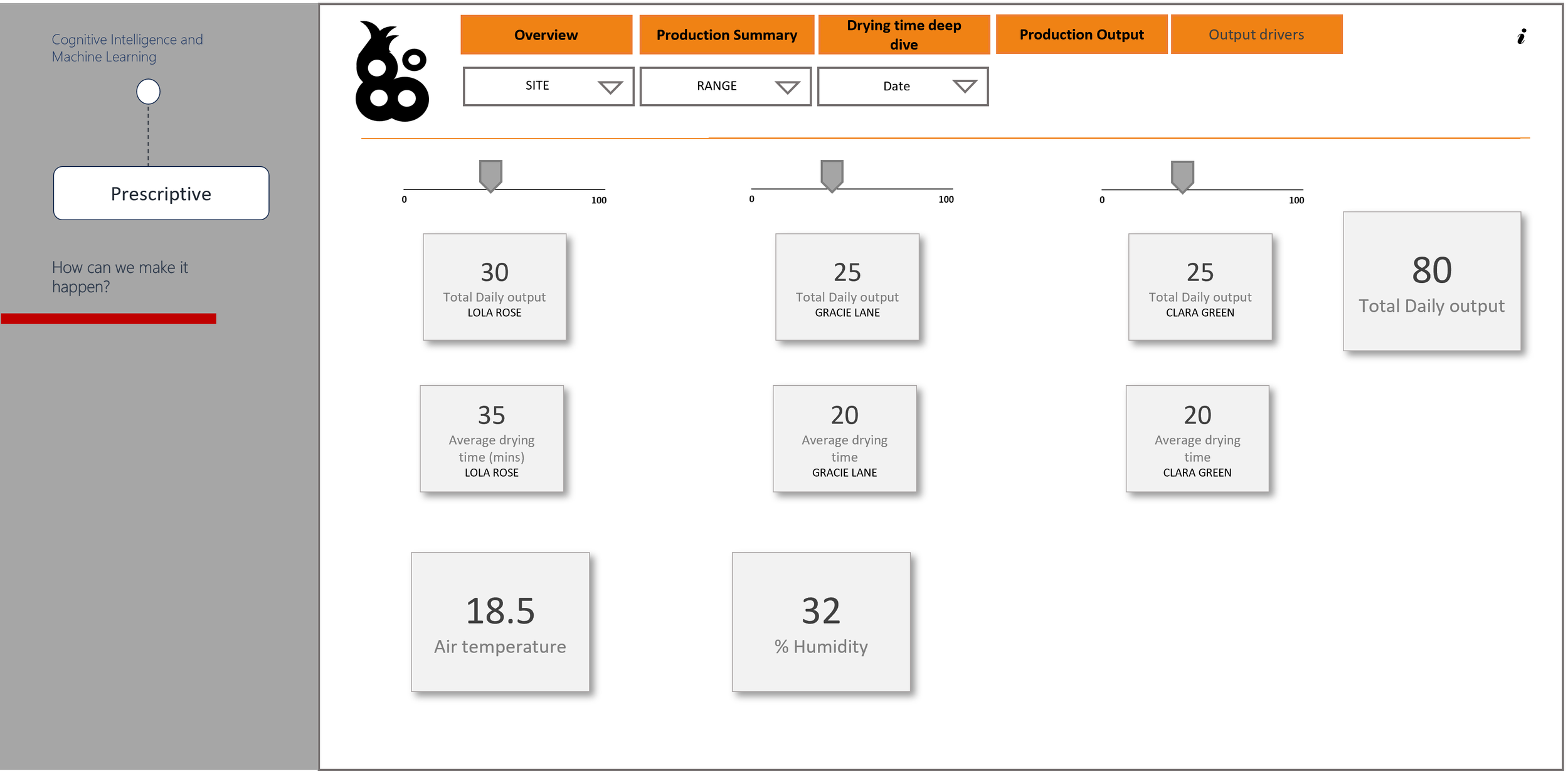
Below is an example of how a typical dashboard layout looks.

Why does it look this way? Principally, when we are designing dashboards we follow the principles for website design, but are these rules inclusive? Traditionally, websites are viewed on a desktop or laptop, in the absence of these to view a traditional web layout, the user experience is not the same. It’s made very difficult by the constant scrolling and zooming in and out. Whilst we know that a certain amount of scrolling can’t be avoided, a mobile adaptive layout should be created as an alternative option for users. Inclusive design isn’t just about visual impairment, it covers neurodiversity, physical impairment, mental health, and technical limitation. Notice how I am using the term ‘inclusive design’ as opposed to ‘accessible design’, accessible design calls out differences in users, inclusive design includes all users needs. A good example of inclusive design vs accessible design is a ramp that considers all users needs as opposed to stairs and a lift that silos users based on their needs.
Web Content Accessibility Guidelines (WCAG2) is developed through W3C, it sets out a series of standards for creating web content that considers the needs of anyone accessing it. Using the P.O.U.R Principles can help navigate the WCAG2 standards to ensure compliance. Let’s take a closer look at the P.O.U.R principles and how we might put it into practice.
P – Perceivable, this is about ensuring any user can perceive an object. For example, when using icons, ensure 1), they have ALT text and 2), that they are universally identifiable. Users also perceive colour differently, not only due to visual impairments, but neurological conditions such as synaesthesia, which causes the user to see numbers as colours. There are other ways to ensure elements can be perceived by users, such as ensuring high contrast in colours, i.e. black text on a white background. Essentially, each element must be visible to all their senses.

Above is an example of low contrast vs high contrast. The image on the left is legible to some users, but not all, whilst the image on the right is a much higher contrast and can be read by more users. There are many tools available online that can help when choosing an appropriate colour palette.
Color Palette by Deque allows you to import your colour palette in to see where they stand against WCAG 2.1 AA colour contrast requirements.
If you don’t have a colour palette, Accessible Color Palette Generator | WCAG Compliant (venngage.com) will generate a colour palette based on the WCAG 2.1 AA colour contrast requirements.
O – Operable, the dashboard must be useable, that sounds like a given, but often that’s not the case. It’s an easy trap to fall into. So much goes into preparing the data to ensure the numbers are correct, that often the front end of the dashboard is neglected. I’ve seen instances where tooltips cannot be picked up by screen readers but are commonly used on dashboards to show additional context. Developers should always test their dashboards to ensure that it makes sense to a screen reader user. Users mustn’t be made to perform an action that isn’t possible for them, for example, clicking a mouse. Dashboards need to be designed to accommodate any screen size. All to often, I’ve seen dashboards being designed and created on wide screens, resulting in users with small screens being unable to access certain features, titles being cut off, filters unavailable. Below is an example of how a dashboard that is developed on a large screen might look if the user tries to access it on a smaller screen.

Inclusive design isn’t just about a user’s personal limitations when it comes to using tech, it’s also their technical limitations, be that their own technical ability or the agent they have available. A dashboard must be intuitive for users with technical limitations. Often dashboard layouts will emulate a website as most users are familiar with websites and for the most part find them easy to navigate. There are some basic rules you can follow to ensure that your dashboard is intuitive. If you are building a dashboard for an organisation that has existing systems, where possible align the branding and layout to those systems as users will be familiar with the layout. Consider the information hierarchy, moving from the highest level of information to the more granular. In the West we read from left to right, therefore the most important information should be top left and flow down to the bottom right. This is essential when deciding the information hierarchy for your dashboard. The tab order is read by a screen reader and must replicate what is visually presented on screen.

U – Understandable, how is this different from perceivable? In the context of a dashboard, it’s about making sure the visual itself can be understood as opposed to just being seen. Is it labelled correctly? Is it in a sensible position, next to related elements? Is it using the correct and the simplest chart type? Data art where data is visualised in beautiful, complicated graphics are very impactful, but some examples of it are not very accessible, complicated visuals are not easy to understand. Animated visuals can also be difficult for users with limited technology as it may not render correctly. Ultimately, dashboards are used in decision making, the information can’t be misleading. It’s important to select the right chart when creating a dashboard. The diagram below will guide you to choosing the right chart.

The correct chart selection also applies to the next principle, R – Robust. Users should be able to access the content as technologies advance, so visualisations that are not company approved are not recommended. All the content in a dashboard should be available through any user agent, including assistive technologies. This means as technology advances, content is still accessible. If we look to a very old school example, Adobe Flash. It was used to create multimedia such as interactive animations to be embedded on websites. Anything created in Adobe Flash required a browser to have a Flash player, but as mobile adaptive grew, screen sizes changed, so too did internet browsers, and they could no longer support flash players, therefore anything being built in Flash was not supported, Flash elements were designed for large computer screens, they weren’t suitable for mobile devices. Security was also an issue, with Flash player being repeatedly hacked. Adobe has now officially stopped supporting Flash in 2021 and has blocked Flash content from running in Flash Player. Web browsers have removed all Flash-related software. So how do you ensure your dashboard is robust? Firstly, consider what agents the dashboard is going to be viewed on, does it support your dashboard in terms of the type of media you are using? Not all agents will support animated charts, therefore it is best to avoid them. Images should be used sparingly, as they might not fit in every screen, they can also slow load times, especially on mobile devices. Ultimately it is about ensuring that no one is left behind as technology advances. Tools like Power BI give the option of creating a dashboard in a mobile view as well as a desktop view. This allows the user to access a mobile adaptive view and a desktop view depending on the agent they are using.

There are many online tools and resources that can help a BI developer ensure their dashboard is accessible. It is worth noting that most of these resources focus on web, mobile app, and general UI design. There will be extra considerations in a dashboard around choice of chart type, labelling of charts, filters, and other features such as export to Excel. Extensive user testing with a diverse group of users will establish user needs around chart functionality and the information they need to access. User testing will need to be done from two lenses, persona based, how does the user interact with the tool, for example, how do they want to navigate it, what functionality do they need? Role based, which will not often be used in traditional UX design, dictates what information is available within the dashboard and in what order. The WAVE tool is an extension available in all Browsers and helps identify accessibility issues on a web application to ensure inclusive design. Whilst the WAVE tool will help identify issues, it is up to the developer to be familiar with accessibility requirements and identify and correct them. The example below shows what happens when I ran the WAVE tool on a website. It scans the webpage for accessibility issues and provides a summary of the issues that allows you to drill in and view the details. The WAVE tool will advise on things like missing ALT tags, contrast issues, tab order issues. It sorts issues into six categories: Errors, Contrast Errors, Alerts, Features, Structural elements and ARIA. Let’s look more closely at what each of those categories mean. Errors indicate issues that will impact certain users and where there is a failure to meet WCAG. Contrast Errors are when text fails to meet WCAG standards. Alerts are elements that may cause issues, developers need to decide for themselves if these are issues. This is where a knowledge of your user’s needs is essential. Features are elements that could be implemented to improve accessibility. Structural elements identifies hidden elements in the HTML and indicates any nesting of elements. ARIA is a W3C specification that stands for “Accessible Rich Internet Applications.” It consists of markup that can be added to HTML in order to communicate the roles, states, and properties of user interface elements to assistive technologies (AT). This category identifies where ARIA is being used in a website.

WAVE is a very useful tool, as it gives a BI developer a good indication of where possible accessibility issues exists. It is worth noting that it is aimed at web developers, however I would still recommend running your dashboard through the tool once it is published. The WAVE tool combined with your own knowledge of inclusive design will ensure that your dashboard is inclusive of all user needs.
Inclusive design is never a ‘nice to have’. Our world is diverse, but often designs are not reflective of that because they haven’t considered all user’s needs. This has resulted in products and services being out of user’s reach. This is simply not acceptable. More and more our world is becoming data driven. Data accessibility is critical. Inclusive design is essential. This guide will help with the basic requirements for inclusive design, but for more in depth requirements, it’s essential to carry out extensive requirements gathering before beginning development and testing every iteration at intervals with your users. As a BI developer, it is vital to have inclusive design at the forefront of your mind when developing a dashboard so no user is left behind.